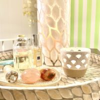
Celebrated in this colorful blog feature, Will Taylor has been an inspiration in these parts ever since I first came upon his signature brand of #MakeYouSmileStyle, and the magnificent trappings of his Bright/Bazaar brand and website. Culling and curating from his travels and life experiences, Taylor conjures a vision and lifestyle that he also manages to make affordable and livable, something many style arbiters all too quickly forget. His furniture line is now available on QVC, lending availability to affordability, and merging commerce and style in fabulous fashion. Earning this Dazzler of the Day is just the latest in a long line of accomplishments. It’s also a nod to a person who stands behind his brand with noble intentions and a clear desire to make the world a little better by making us smile a little more.
Category Archives: Home Design
April
2023
August
2021
An Apology to Beige and Cream
It is likely the aging process as much as the monochromatic design schemes trending on social media designer accounts, but I have a long overdue apology to make to Beige and Cream, as I’ve maligned and bad-mouthed them for years, when all along they haven’t been nearly as offensive as Maroon or that ghastly Hunter Green. In fact, I’ve embraced the white and cream look for the attic loft, reveling in the calm and tranquility such a color design evokes – something I never really took into account in all the years I favored walls of lime green and curtains of fuchsia and pillows of teal and turquoise.
When I first moved into the Boston condo my Uncle rolled on a striking shade of scarlet, which I ragged off for a mottled effect that just read deep bordello red in all photographs. Juxtaposed against this in the adjoining kitchen was an equally strong shade of Kelly green. The bedroom was a deep but bright blue, while the bathroom would cycle through peach and lavender and pink over the years. In other words, I loved color – and I still do – but I’ve come around to appreciate a more nuanced and subtle use of it in my advancing years.
That goes for the garden as well. I never had an overall design in my mind, with the exception of a long row of carefully plotted out Thuja ‘Steeplechase’ infants that now form a living privacy wall thirty feet tall. The gardens themselves would be haphazardly filled with whatever perennials or shrubs caught my fancy through the years. Somehow, it all worked, and even when it didn’t, I managed to find joy and appreciation in everything I planted because I only planted that which I genuinely enjoyed. There’s a method in that sort of madness I suppose, but looking back at the cacophony of color that explodes and recedes at various weeks of the summer, party of me wishes I’d gone with a more cohesive design plan.
Where once I scoffed at monochromatic garden designs, I now find myself drawn to them, and I appreciate the unifying sense of connectedness and the ease it brings to the eyes. Maybe I’m getting boring in my older age, or maybe I’m simply refining my taste. Either way, I’m a tree and I can bend. The evolution continues. The growth doesn’t stop. And there’s always room for more.
(As for you, Hunter Green, you still suck and you always will.)
August
2021
Dazzler of the Day: Jonathan Adler
Ideally, and if we keep working at it, our tastes and design preference evolve and grow over time. When I first encountered the style of Jonathan Adler, I wan’t quite ready to appreciate and love it, but back then (mid 90’s) I was in the midst of some very questionable obsessions. These days, I’m in full adoration of the bright and whimsical elements his work brings to a room, and so he has been named Dazzler of the Day here, because dazzle is what he does best. Check out his site here for more gorgeousness.
June
2021
The Summer Place to Be: Scandi Attic Loft
“Somebody has to go polish the stars,
They’re looking a little bit dull.
Somebody has to go polish the stars,
For the eagles and starlings and gulls
Have all been complaining they’re tarnished and worn,
They say they want new ones we cannot afford.
So please get your rags
And your polishing jars,
Somebody has to go polish the stars.”
~ A Light in the Attic
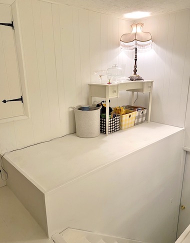
When we first purchased our home, there was a little attic/loft area which once functioned as a children’s play space, at least judging from the writing in the closets. On the floor was a dark, glued-down industrial ‘carpet’ that was like black and blue astroturf. It looked awful and smelled even worse. I scraped it off – by hand – then sanded it down – by machine – and painted it all white (paneling, floors, and ceiling). Since it was still rough around the edges, the easiest style to conjure was a shabby chic hybrid – and twenty years ago it was all the rage.
I hung floral curtains to mask an ugly metal divider gate, whitewashed shelves for decorative purposes, and raided the Marshall’s shabby chic section to fill it with fringed monstrosities. It served its simple purpose as a surplus room for guests, but eventually we stopped bothering to keep it up. It went unheated in the winter and un-air-conditioned in the summer, so it was mostly uninhabitable.
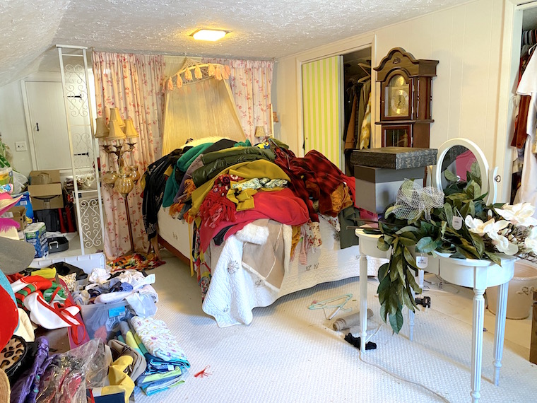
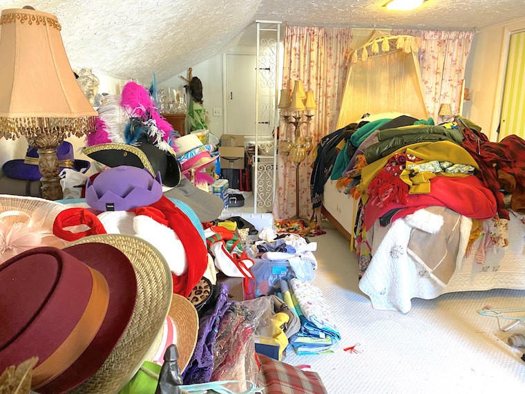
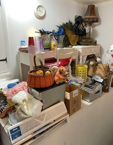
What began as a shabby chic attic evolved into a messy and practically unlivable storage space as time passed and we focused on other parts of the house. So bad did my clutter get that mere walking was often a menace, and navigating the piles of stuff was an exercise right out of ‘Hoarders: Buried Alive’. Reclaiming it from ‘Grey Gardens’ territory took a lot of garbage bags and some ruthless editing, but I spent the earliest weeks of spring making it happen, just as the sun began to heat the room nicely. This was a serious sort of spring cleaning – more than dusting or shifting clothes. It was designed to aid in our storage issues, and to create a bit more space for us. The work began on the staircase, where we had been lining each stair with bottles of soda and seltzer, then spilling it into the space above the stairs, with bags of coffee beans, kitchen items, holiday decor, and things like a fryer, an ice cream maker, and a waffle maker. You know, the shit that gets used twice a year, and only if people are coming over.
Once a little space was cleared, and the place could breathe again, inspiration built on itself. I was rapidly filling 55-gallon garbage bags with the unused detritus and nonsense of two decades of impulse buying. A few items I managed to sell on FaceBook Marketplace, which would provide funding for the slight change-up in style I had in mind.
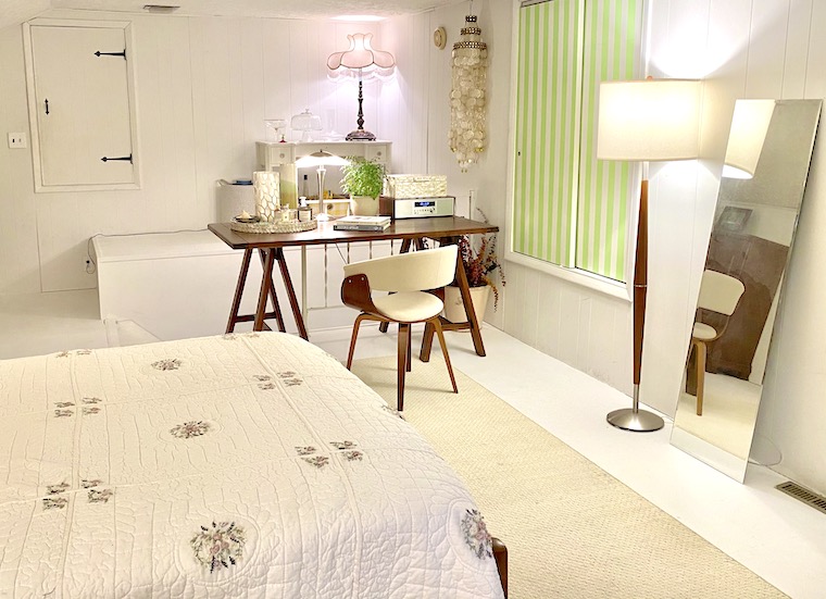
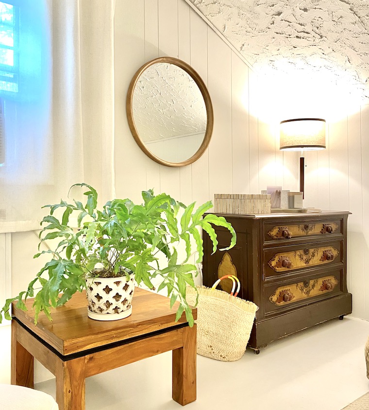
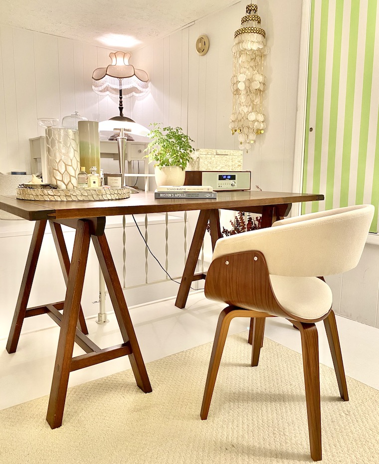
After obsessing over the concept of hygge over this past winter, I wanted a similar spirit to infuse this attic loft for summer, so I turned to a Scandinavian slant, giving in to a white-washed brightness tempered with some natural wood and ivory shell inlaid work.
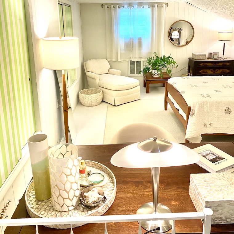
Influences and accents of Scandinavian style and mid-century simplicity injected the room with a calming atmosphere – a bright, livable space just in time for the summer season – and the summer guests.
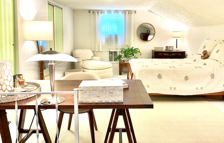
Andy’s antique wooden bed-frame reclaims pride-of-place in the center of it all, shifting the purpose and intent to one of repose and relaxation. It turned out so well I may entertain an office move to this area at some point. I’ve already taken to napping here in the afternoon.
Cue the background music for the rest of the tour…
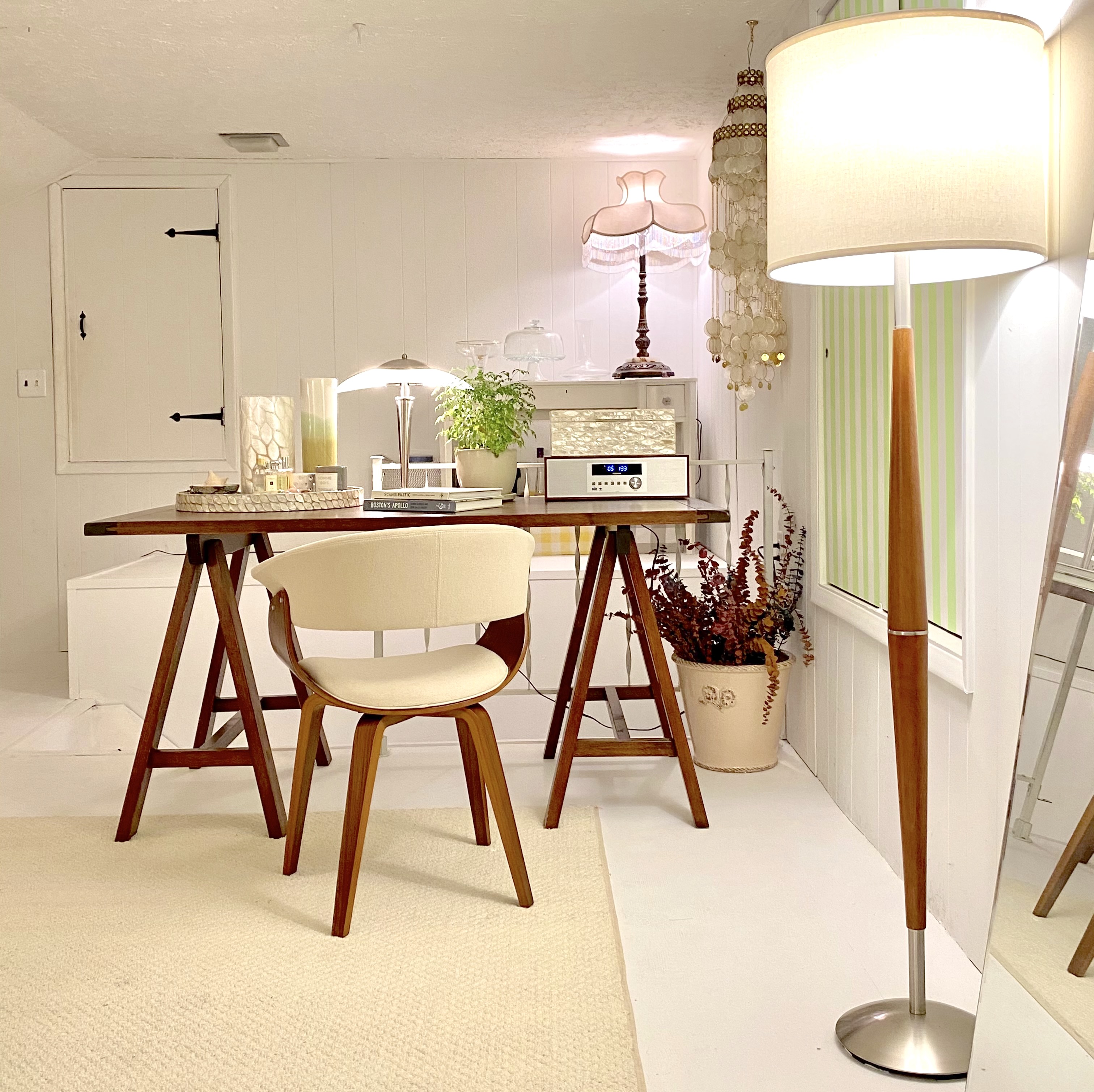
A new sound-system designed like a mid-century radio allows for music to inhabit the place, immediately bringing new life and energy into a room that had previously stayed largely quiet. (You can see it on the right side of the desk below – unobtrusively elegant in a slightly retro way.)
The multitude of lamps are a necessity because there is only one small window to light the expanse – and half of that is taken up by an AC unit in the summer. While that one East-facing portal allows some morning into the space, it’s not nearly enough for the bright and airy feel I was going for, so lamps abound. That makes this the ideal space for rainy days as well, when you can hear the pitter-patter of raindrops on the roof, lending it a coziness unparalleled elsewhere in the house.
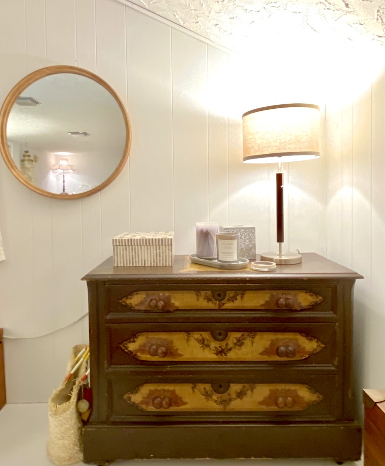
Along with Andy’s bed, my grandmother’s old chest – a hand-painted piece of wooden craftsmanship – adds some love and nostalgia, warming the white and cream environs, and grounding its corner with a necessary element of dark wood.
Almost twenty years into this home, it’s a welcome bit of enchantment to find that there are still places to surprise and thrill, repurposing themselves into a new addition that costs only as much as a bucket of paint and some new lamps and such. I’ve got some more pictures to hang, and a few more accent pieces to find, but this is already perfect for guests to visit. Here’s one more song to welcome summer:
“How much good inside a day? Depends how good you live ’em. How much love inside a friend? Depends on how much you give ’em.” ~ A Light in the Attic
August
2016
Cleaning Up My Act
My preferred mode of living would be to lounge on a fancy fainting couch, outfitted in some impossibly glamorous and impractical robe spilling generously around me, and concern myself only with the gentle wafting of a feathered fan at the trained hand of a happily subservient husband. Failing all of that, my reality is far more mundane and woefully rigorous. For some reason, this summer has been about cleaning up and clearing out. Perhaps I’d finally gotten sick of seeing clutter everywhere. Perhaps my Virgo nature finally had enough. Perhaps I was afraid we were one cat away from turning into a disturbingly-real ‘Grey Gardens’ scene. Joking aside, I actually think it was more meaningful and deep than that.
My tendency to nest and focus on the house rears its head when I’m afraid – and this summer has done more to stoke my fears than any other summer on record (with one possible exception). The atrocious attack on the Pulse nightclub in Orlando, the shootings in Dallas, the attack in France, and on a more personal level the unexpected death of a dear friend’s brother – all of them conspired to haunt the sunny season. In addition to that, the rise and rise of Donald Trump, the scariest thing to happen to this country in a long while, was and remains reason for serious consternation. Taken together, these events coalesced into a very dark stretch.
At such moments, I tend to turn inward. Though The Delusional Grandeur Tour continued in book and theory, my traveling largely diminished. The focus was on my home. It began in the side yard, with a massive one-man clearing effort. 37 lawn bags later, and several cuts and bruises whose scars still remain, we are once again able to see through to the neighbors’ fine yard (as well as to the recent carnage of a hawk, who had torn a squirrel inside out and left its insides as a meaty gift to a thousand flies).
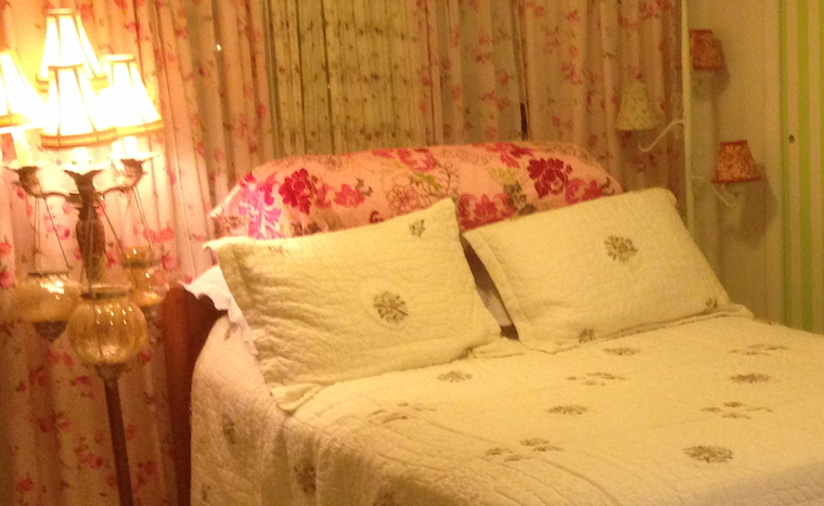
Back inside, and rather foolishly during a run of extra-hot days, I focused on the attic. Half of it was decent, finished living space when we first bought the house. I had torn out the ugly (and smelly) carpeting (every square inch of which was glued to the floor with industrial strength crazy glue) and painted the floor and paneled walls a bright white. The space instantly opened up, and a collection of whitewashed accents lent the space a pleasingly shabby-chic style that went well with some floral curtains and an old-fashioned floral-bordered bed spread. I’d lie on the bed and read at night. It was quiet space – no television or stereo – and on rainy nights you could hear the drops pattering on the roof.
Over the years, however, that space became a repository of anything and everything. It started with clothing (which very much formed the bulk of items that towered toward the ceiling). There were two floor-length closets in the eaves, but as extensive as they were, they soon filled to the breaking point. After that, it was a free-for-all. Seasonal items like outside pillows and tablecloths, summer cups and holiday serving trays, the wide-ranging collection of curtains that I kept switching out like last season’s shoes – oh, and all those shoes – accumulated and piled up to the point that it was difficult to walk from one end to the other. It became a total hoarder’s room, and I finally got sick of it.
I got a big box of industrial strength 55 gallon garbage bags and filled them all. Hundreds of items of clothing were donated, and well over a decade’s worth of collected detritus and debris, the pretty wreckage of all things whimsical – feathers and hats and costumes and jewelry – the beads and sequins and fabrics of silk and velvet – were unceremoniously tossed. I was ruthless because I had to be, and there’s still a ton that needs to go, but for now it’s enough to be able to lie on the bed, listen to the rain, and escape into a book.
The attic is once again open for business.
August
2016
Virgin Attic Romp
This is the very first post written and created entirely within our attic guest room.
A grandfather clock ticks to my left, its pendulum swaying back in motion after years of rest.
Fringed lamps glow in all corners, brightening an otherwise dreary day.
It falls heavily on the roof, but the sound is soothing, muffled. A gentle drone, perfect for sleep or contemplation. The ultimate din of background ambient noise to cure anyone’s insomnia.
Here, I sit on a newly-made bed and type out these words.
Even the bright glow of the lap-top is too harsh for these soft environs, and I lower the brightness until it reaches a pleasing level.
On rainy nights, and Tuesday mornings, that’s the best we can do.
March
2016
A Boston Bathroom Renovation In its Infancy
With the very obvious exception of the day it’s finally done, the early days of a renovation project are usually my favorite part of any undertaking. After well over two decades of untouched. but decently serviceable performance, it is time to renovate the bathroom at the Boston condo. I’ve been putting it off for a few years, mostly due to funding and lack of ambition. Re-doing our kitchen in upstate New York was enough of a headache to put me off of a project of this much import for a couple of years, but with a toilet that keeps running (and wasting water) as well as a shower that has always been a little leaky, I decided to bite the bullet and put this plan into effect.
A few measurements, some online browsing, and a retirement loan later, we are at the starting stage for this renovation. I’ve got a good idea of what the layout and design will be, and it won’t involve any change-up in plumbing location, which is probably the only good thing. Everything else will need to be re-done. Being that I’m not living there full-time makes things better and worse. There will be some Hotels Tonight stays that result, but I won’t need to deal with living in dust and debris 24/7. Pros and cons to both. Early days yet. And all is possibility.
Hopefully the work will get underway by late summer or early fall. It’s a small space, but it’s in Boston. Pros and cons again. Right now I’m solidifying the design plan (clean, minimalist, and Zen-like, with modern flourishes and lines, that somehow utilizes an exposed brick wall) and seeking out contractors. If you know of anyone reliable and reasonable, please send some recommendations my way. Though it’s a big project for me, it’s only a small bathroom for everyone else. Somewhere there’s someone who’s perfect for the job. (I’d also throw in some free advertising seen by thousands each day – ahem…)
The best and only way I’ve found of getting through such an endeavor is to find an inspiration piece, and focus on that when things get difficult. To that end, I have an image, and a feeling. It’s an image of elegance: a pair of Tom Ford Private Blend bottles nestled beside one another, on the edge of a bamboo-fronted vanity backed by sleek white subway tile, perhaps something in aqua-hued glass. The feeling is one of serenity, after a long day of walking through the South End, wrapped in a waffle-weave bathrobe following a blissfully hot shower.
Now, how do we get there… from here?
January
2014
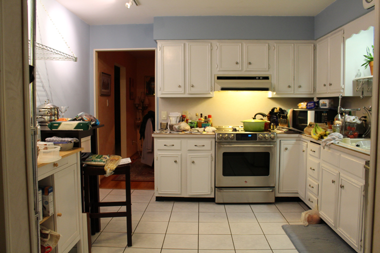
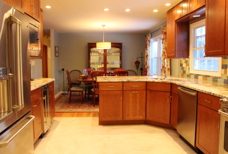
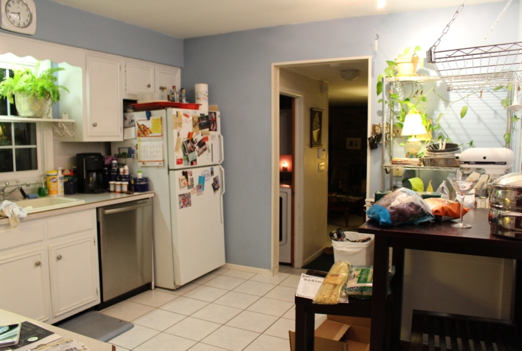
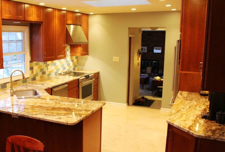
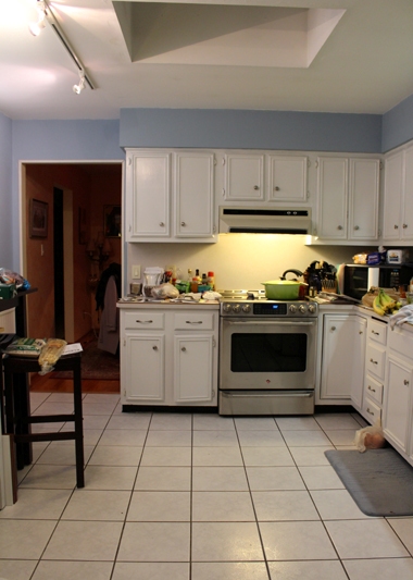
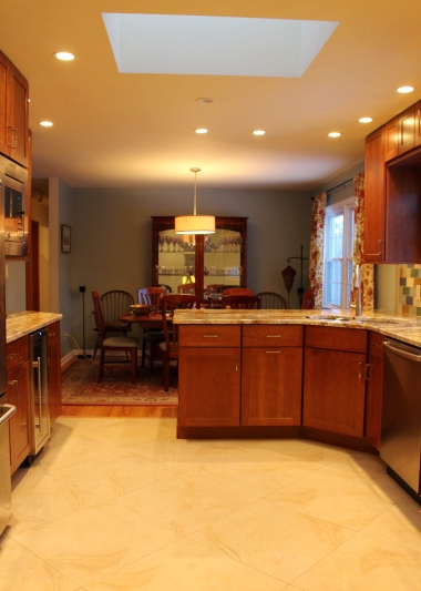
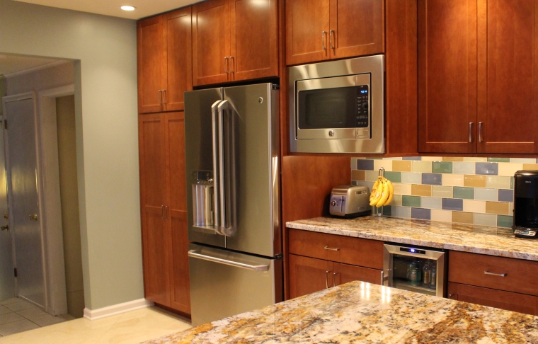
The Big Reveal: Our Kitchen ~ Before & After
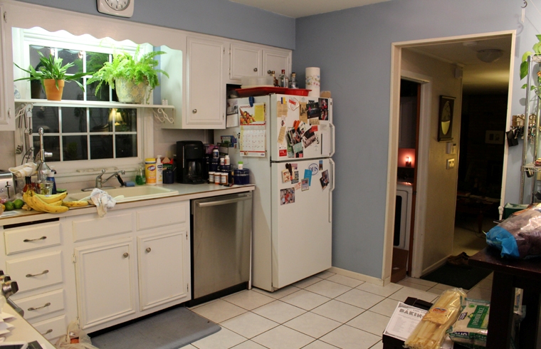
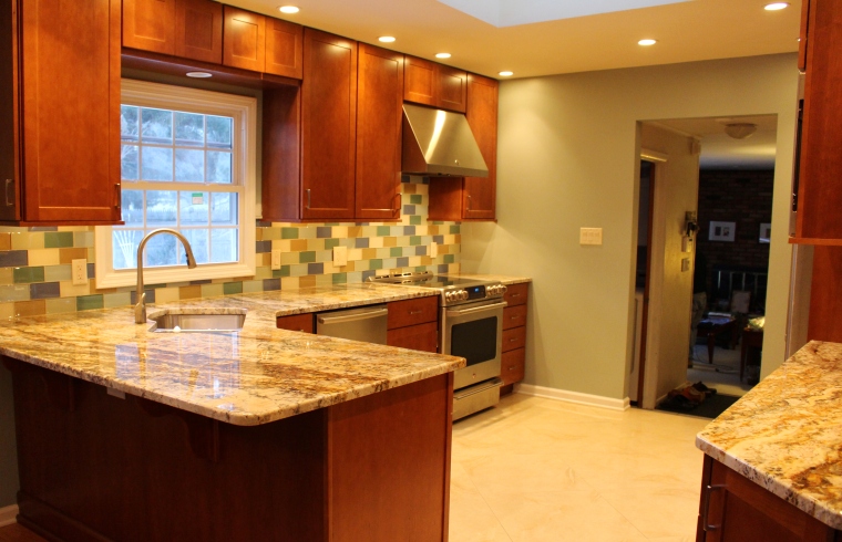
Having already droned on about our kitchen adventures (See Part 1, Part 2, Part 3 & Part 4], I see no reason to exert myself further, nor the ears and eyes of what visitors remain here. So, without further ado or build-up, here are the Before and After photos of our new kitchen.
January
2014
The Kitchen Project ~ Part 4
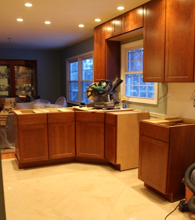
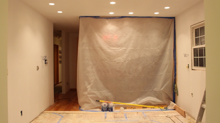
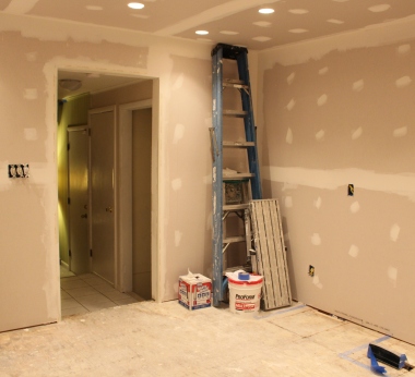
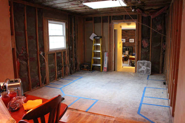
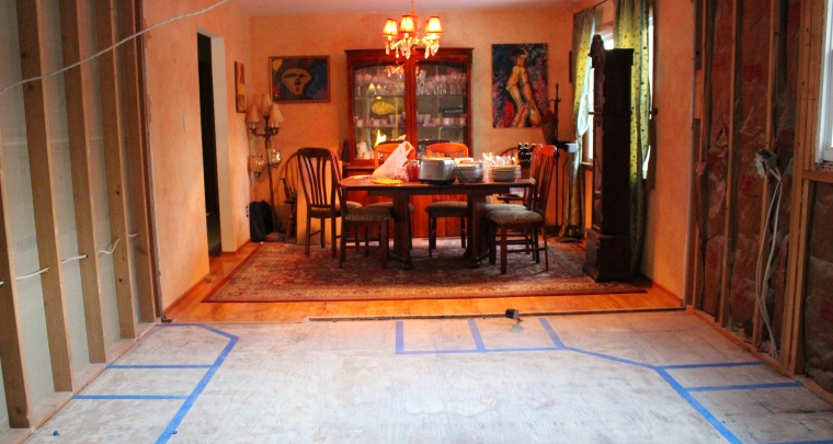
On the first day of demolition, the walls came tumbling down. What had divided the kitchen and dining room since we purchased our home was gone. I could be working at the dining room table and see clear through to Andy in the family room. People in the kitchen could talk face-to-face with people in the dining room. But while all this was now possible, it wasn’t quite practical at this particular point. Nothing but bare wood, bare joints, and a bare floor was before us. In the first flush of cold winter weather, a sheet of heavy, dusty plastic was all that kept the outside at bay. It was a dismal scene, but we were both so happy with the space and the removal of that wall that we didn’t care. The excitement of that saw us through the first few days. Eating out was a joy, and since the contractors had moved the fridge and microwave into the family room, we were making do in far easier fashion than either of us expected.
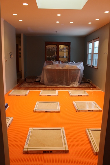
Still, it was not without its drawbacks. There was no sink in which to wash dishes, which made many things more difficult. There was no running water, except in our tiny guest bathroom sink, under which it was difficult to fit a tall glass. When the tile floor was installed we had to stay off it for 24 hours, which split the house in two – Andy in his usual family room wing, and I in the living room faction. We could shout to each other and wave, but to cross to either space we needed to walk outside. Normally not a big issue, but at midnight in December? Dicey.
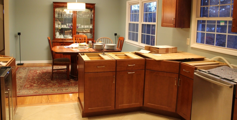
Soon though, sooner that it seemed possible, things came together. The contractors – the amazing crew from Skylands Services – were excellent. Work continued on-schedule and on-budget. When the first cabinet was installed, we could see through to the light at the end of the tunnel. And once all the cabinets were in, and we had the stone supplier measure the template, the end was clearly in sight.
We stopped by Empire State Stone to map out where the main peninsula countertop would be cut from the piece of stone we had selected. On an ice-laden path, on a bright winter day, we stood outside and placed the cardboard template over the granite, incorporating just a bit of the main black veining to peek out from the sink. Andy held one end and I held the other. In tandem, we maneuvered the outline of what we had been waiting to see for months – years, really. One of the staff outlined the placement, and we held up the other counter template, capturing more of the winding variation that Andy favored. Then it was time for more waiting until the stone was cut. Even that seemed to move quicker than we thought. For a brief moment I felt a twinge of sadness that the project was coming to a close. I knew Andy would miss the activity and excitement and daily dose of fun that the contractors provided. He mentioned that on their last days he felt like he was sending off kids to college. But like those moments, it was for the best. We’d been through an enormous upheaval, and had survived. A little battered and war-worn (recall the poor kid who had lost the tip of his finger on a wood saw), and a little tired and displaced (we’re still trying to figure out where things should go), we made it through the wilderness.
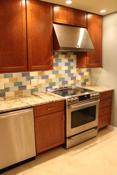
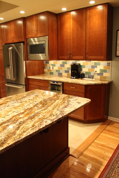
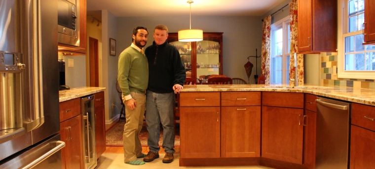
From the stark, white cabinets, and cold gray floor to a warm, rich cherry wood and warm, clay-swirled tile, from a sterile, manufactured formica countertop to a beautifully-grained natural granite, from a boxed-in divided kitchen and dining room to a united, airy, and spacious space, with room enough for two to work at once, our kitchen had undergone a complete transformation.
We had finally taken the wall down. What was once divided was now one, what was once disjointed and claustrophobic was now flowing and open. Some home renovations test and stress a married couple, some bring them closer together. Whatever the outcome, we had a new kitchen ~ a new heart of the home ~ and, maybe, a chance for a bright new beginning.
I pause at the sink, resting my hands on the soft curve of the stone counter. Outside, a layer of snow brightens the backyard, and I peer through the bush where a couple of cardinals sometimes perch and sing. Across the yard, I make out the faint trail of a bunny that bolted across the space a few days ago. A rough wind shakes more snow out of the cherry tree, and I think back to those September days of planning and dreaming. The pool is covered now, blanketed by snow and ice, and the branches of our gardens are bare and stark, but in a few months it will melt away. We’ll see the dark green and brown of life return, like we saw it on the first night we found our home, when the first whisper of spring tickled our ears. On that March evening we walked around the backyard and made out the faint outline of the pool beneath its ragged cover. We made a covenant with our home then, and began a new life together. I close my eyes and make a wish that spring hasten her steps.
~~~~~~~~~~~~~~~~~~~~~~~~~~~~~~~~~~~~~~~~~~~~~~~~~~~~
COMING UP NEXT: The Before & After Shots
[See also Part 1, Part 2 & Part 3]
January
2014
The Kitchen Project ~ Part 3
We knew we wanted something with heavy graining and variation for our granite countertop, not the usual uniform, igneous patterns that might as well have been man-made. At the granite showroom, we found a few pieces we liked of the Yellow River, but they looked toned down. Far more enchanting was a piece with lots of amber and black – called ‘Betulare’ – that was much deeper and more interesting than what we had been looking at, but maybe it was too bold. I thought for sure that Andy wouldn’t like it, that it would prove too brash and daring for our space. But he wandered over and was just as enamored as I was. Sometimes, even after thirteen years, husbands have a wonderful way of surprising each other. We were advised that their stone suppliers had websites, where we could view the actual slabs online, and then pick out which one we liked. We could then visit the supply site itself to see it in person. For such an investment, I reasoned that it would be worth the drive to New Jersey (little else is).
A few weeks later, I got up long before the sun was out and started the journey to select our granite. I knew Andy didn’t want to make the round-trip with his back, so I loaded some 80’s music into the stereo and made a relatively easy trip down. The pieces we had chosen from the online selection needed to be moved, so while we were waiting the woman who let me in – New Jersey from her thick accent to her fluffy fur vest straight off a Real Housewife – invited me to look around with her at the other pieces. Next to our marked lot of stone stood a more intriguing slab – it was the ‘Betulare’ – and this wondrous piece of granite was from Brazil. A dramatic black vein ran through the middle of it, while blossoms of black specks bloomed along the winding rivers of the granite’s grain. That flow was what most appealed to us, and the variation – striking in its non-repetitive non-pattern – would keep it infinitely interesting. It wasn’t what we had ordered, but it was right next to what we ordered, so I took it as a sign. Our original stone was still being moved as we made our way around the rest of the supply room. Slab after slab of enormous rock stood on their sides, revealing all sorts of granite and other stone. There was a stunning piece that was almost entirely a glossy black, cut through with just a few small lines. I didn’t like it, but thought about sending Andy a photo of it telling him I’d make a slight change in plans. (I wasn’t that mean.)
As we came back to our starting point, the stone had been moved, and I could examine the selection we’d made online. In person, it read much flatter than in photos. The ‘Betulare’ to its side was definitely the better choice. It was what I was first drawn to, and those initial gut instincts are what has saved me many times. I took a few photos of it for Andy and told the woman these were the slabs for the countertop. She marked them, I filled out some paperwork, and was back on the New Jersey Turnpike in less than an hour after I got off. (Well, following some Full-serve gas treatment, the pumper of which was none too pleased when I got out and headed toward the pump myself out of habit.)
With all of our materials ordered and set to be delivered, we scheduled the start with the contractors for December. The holidays would be different this year, and though we knew it would be tough, we forged ahead. A sacrificed Christmas this year would make for a better one next year – and, far more importantly, a stellar spring and summer.
{To be continued…}
[See also Part 1 & Part 2]
January
2014
The Kitchen Project ~ Part 2
After narrowing down the style of cabinet, and figuring out the basic set-up of the room, we finished up with that initial consultation and made our way to the first tile store, where we were promptly overwhelmed. We should have gone in with an exact idea of what we wanted, instead of going in blindly to find whatever spoke to us. There was simply too much, and it was overpowering. We struggled to find the backsplash and the floor tile, but realized it was not happening. At times like that, it was best to step back and take a break from looking – to clear the head, focus on something else, and return when you’ve had some time away.
Meanwhile, in our old kitchen, I held up the cabinet samples. The white looked all right. I’d previously painted the current cabinets a similar white, so it wasn’t a shock to see. But I noticed as I placed the sample next to what was there, how dirty and dingy the older ones looked. Andy had mentioned the clean-up and up-keep involved in white, but I hadn’t listened. Here was the proof.
I lifted the cherry sample up against the old cabinets. Beneath the skylight, it glowed warmly in hues of amber, lending a richness that filled the space but didn’t overwhelm. It was comforting. For so long, I’d resisted what was comfortable ~ comfortable didn’t always translate to beautiful, comfort was too often a cop-out, a safe way to go, an acquiescence to the tried and true. I thought of Andy, and his joy at the cherry, and suddenly wondered what was so wrong with comfort and safety. Most people strive to find that in their lives. Here it was, in my own hand, and I laughed a little at my resistance. When I told Andy and Michelle I was okay with the cherry wood, I acted like I “compromised my ass offâ€, but really, I was just giving in to the husband who knew best.
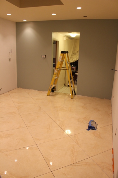
With that decided, we could tentatively use the Yellow River granite we were so taken with, and move on to the selection of floor and backsplash tile. We tried a different tile place, and found exactly what we wanted – a glossy floor tile in a very light tan, with a marble-like pattern to it.
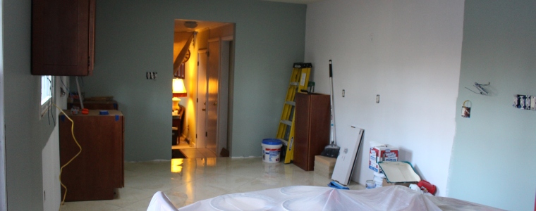
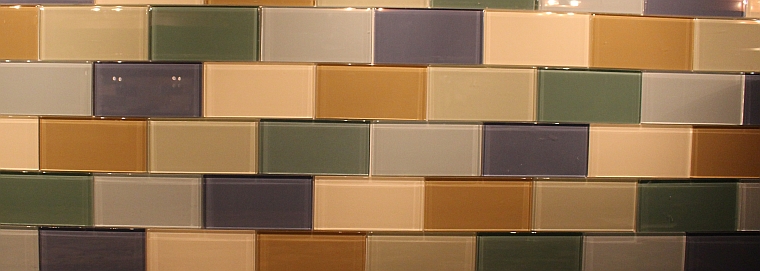
Without the exact piece of granite, choosing a backsplash proved trickier, but there was a sample of the Yellow River on hand, so we chose a selection of glass subway tiles that would work with it. In a softer palette of greens and blues, accented by a soft amber and almond, the glossy glass backsplash would reflect and fill with light. Based on this collection, we chose the paint color for the dining room walls (which now merged seamlessly with the kitchen) and the incidental kitchen wall space. For someone often unfairly, and inaccurately, characterized as loud and boisterous, I liked a green reminiscent of Spanish moss, with the fitting name of ‘Quietude’. That left just the granite, and an adventure in our sister state of New Jersey.
{To be continued…}
[See also Part 1]
January
2014
The Kitchen Project ~ Part 1
It was a Saturday in September when we got in the car and took that first step. The day was sunny and clear, and the trees were just starting to exhibit their first bit of fall color. Our Sweet Autumn Clematis was blooming its head off, the canopy of tiny white star-like blossoms filled with giddy bees. The maples had begun to burn, and the weeping larch was just starting to let go of its green, slowly ripening into the magnificent bright gold it would eventually become. A bright blue sky, accented by a few fluffy white clouds, bloomed brilliantly over all. It was the ideal day to begin a new project – and there was none bigger than a total kitchen renovation.
It would be daunting, and both Andy and I knew that. I always like to prepare for the worst so there won’t be disappointment, but such doom and gloom would prove unfounded and unwarranted for this project. I did not know that then.
We arrived at Builder’s Kitchens with a basic idea in mind – new cabinets, new floor, new appliances, and the removal of the dividing wall between kitchen and dining room. The place to begin was with the cabinets, around which the rest of the room would take shape. (This was news to a kitchen novice like me, who wanted to start with the floor and move up from there.)
For the cabinets, I was initially hell-bent on having white. Sleek, modern, crisp, cool white to brighten up the space and make it feel larger. Even when Michelle, our amazing designer who saw us through the complicated cabinet process, tried to subtly dissuade me from white, both due to cost and eventual wear-and-tear, I stalwartly refused to consider anything else.
Then I looked over at Andy admiring a set of cabinets made of a medium-hued cherry wood. His eyes lit up as he examined them, and it was then that I knew: we would have cherry wood cabinets. I could see how much he loved them, and he was right – they were gorgeous. I insisted on taking the white sample home as well, not quite ready to “compromise my ass off†just yet, but secretly happy that he’d found something so beautiful, and that we could agree upon.
With those choices in our hands, we walked over to the granite island in the middle of the showroom. It was a beautiful, richly-varied piece of Yellow River granite. Both of us were entranced. It was darker than what I’d originally envisioned for a white cabinet kitchen, but as that seemed to be on the way out, it might work perfectly with a cherry backdrop. That granite was so stunning it haunted me for the rest of the day, and the weeks to come.
{To be continued…}
January
2014
Caught in the Crosshairs
Well, the backsplash is now complete. This is a photo of how it looked prior to grouting – I liked the pattern of the spacers, but it seems most people remove them for the finished product. The Before and After posts of the kitchen are coming soon, as well as a lengthy description of how we got from there to here. It all starts tomorrow… Stay tuned.
January
2014
The Grain of The Granite
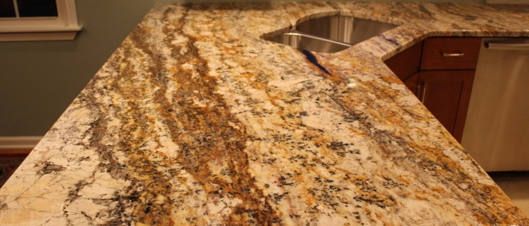
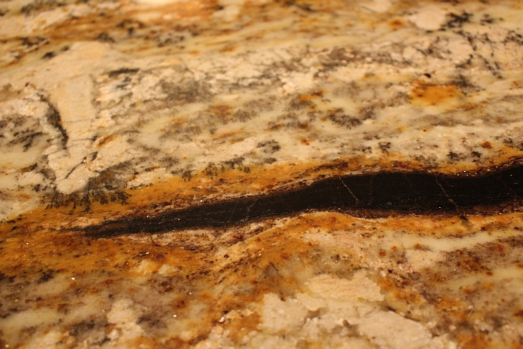
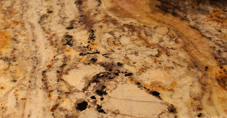
While I promised no more progress pics until the kitchen was complete, it was so exciting to see the implementation of the granite countertops that I’m posting these previews to show some of the details of the stone. To be honest, I was never a big fan of granite. It seemed so ubiquitous in kitchens, and much of it was rather uninspiring and underwhelming, not to mention monotonous and boring. However, upon viewing some samples in various showrooms, I saw that certain granite pieces were rich with variation and movement, marble-like in flow, and as unique as any more obscure stone (and certainly far more durable).
Once we decided on a cherry for the cabinets, I also liked the natural feel of granite next to the wood, as opposed to the man-made composites that came with a much cheaper price tag. It was a splurge that was worth it, and the endless variations will provide us with years of interesting study. I especially like the deep black vein that protrudes from the corner of the sink – we asked for that portion especially. Some people try to avoid such inconsistencies, but I think they make the piece unique.
Next week the back-splash is scheduled to be laid, along with the under-cabinet lighting, and then… well, then we will be finished. But I’m definitely cooking before that, because by the time this gets posted, we’ll have a working sink and dishwasher, and I’m planning a special meal for our first official working-kitchen weekend.
January
2014
A Minor Kitchen Contribution
While it’s always been a dream of mine to hoist a sledgehammer Miley-Cyrus Wrecking Ball-style and do some serious demolition like some of the homeowners on HGTV get to do, the reality of the situation is that no one wants me to be in such a position. I’m a creator, not a destroyer. To that end, my contribution to the kitchen renovation is not a thrown-over shelf or a torn-down wall, but a new set of curtains and reupholstered dining room chairs.
Yes, in addition to crocheting and oboe-playing, one of my secret skills is sewing. Well, sewing curtains at least. I can thread a sewing machine and set it spinning, provided just a simple stitch and a straight line are required, as was the case with the panels I crafted with some fabric from Calico Corners.
I still remember the day in 7th grade, when our Home Economics class (is there still such a thing?) was learning how to thread a sewing machine and sew a few lines of stitches onto a square piece of cloth. It was late fall, and the morning sun was slanting in through the windows of the second floor classroom where a row of sewing machines sat. Dust particles floated through the beams of light, stirred by the cutting of fabric and the whirring of thread. After getting over the practical issue I had with the situation (why were we all learning how to thread a sewing machine, when most of us didn’t have sewing machines?) I made the most of it, managing to thread my machine and create the simple stitches required for the lesson. (And since I ended up with a sewing machine, I guess it worked out after all.) Unlike crocheting though, I didn’t end up loving the process of sewing, so I never bothered to learn more than the straight line required for curtains and the like. So far, it’s been enough to carry us through.
As for the fabric of the curtains, it was chosen on a bit of a whim. I went into the fabric store with no clear idea of what I wanted (always a dangerous thing to do, considering a recent tile selection incident) but this particular pattern – the bold colors and whimsical design – was one of those things I instantly loved. Of course red was not in the palette for the kitchen/dining room area, so there was a good chance it would never work. Upon closer examination, however, I noticed the bit of green that looked like a match to the shade of the kitchen and dining room walls. A tan color running through it might be the same hue of the recently-hung lampshade. Upon securing a sample and having Andy hold it up in the dining room, it was perfect – just the punch of non-traditional pizzazz that the space needed (since I gave up the vibrant white cabinets I originally wanted).
One more step – and one of the last – in the march towards a new kitchen.


